If you are like me, you have been glued to your seat every Friday for the past month. I wanted to contribute some random thoughts and details I have noticed purely on the details of Severance you may have missed throughout the series. My intent is to find an audience with the release of episode 5 that are as interested as the behind the scenes and fun facts about Lumon and why it looks the way it does.
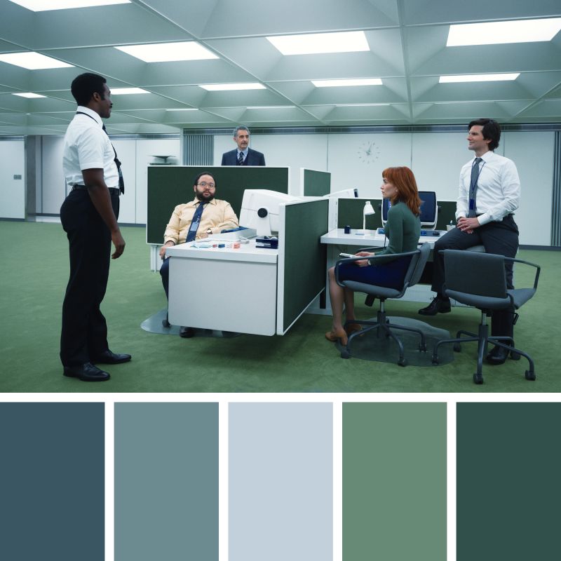
The office spaces themselves embrace a retro-futuristic aesthetic, blending 1970s corporate minimalism with an uncanny sense of timelessness. White, modular desks in endless, carpeted green voids give the feeling of both expansion and confinement, emphasizing the surreal detachment from the outside world. The cubicle-free layout further strips individuality, reducing workers to mere cogs in a well-organized yet strangely barren machine.


Typography plays an important role in establishing the visual look of a piece of art, and Severance is no exception. This page is an overview of significant instances of typographic design and font use throughout Severance, with additional information about the typefaces and where to obtain them.
Manifold Extended is a type family designed by Connary Fagan. It is an extended (wide) typeface heavily inspired by Aldo Novarese's Microgramma, a typeface designed in 1952 and commonly found in technical drawings, corporate styleguides, and science fiction throughout the mid-to-late 20th century. Manifold Extended sees extensive use throughout Severance as the Lumon Industries corporate typeface, appearing not only in the company's logo (modified to use a droplet of water as the counter of the “O”), but also in numerous locations throughout the company's headquarters in Kier, PE.
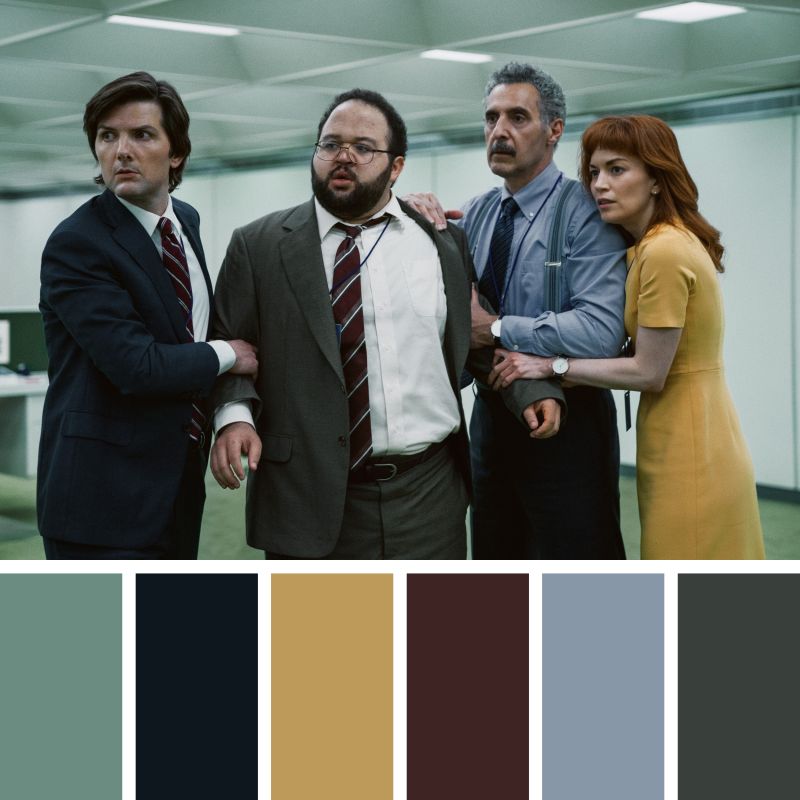
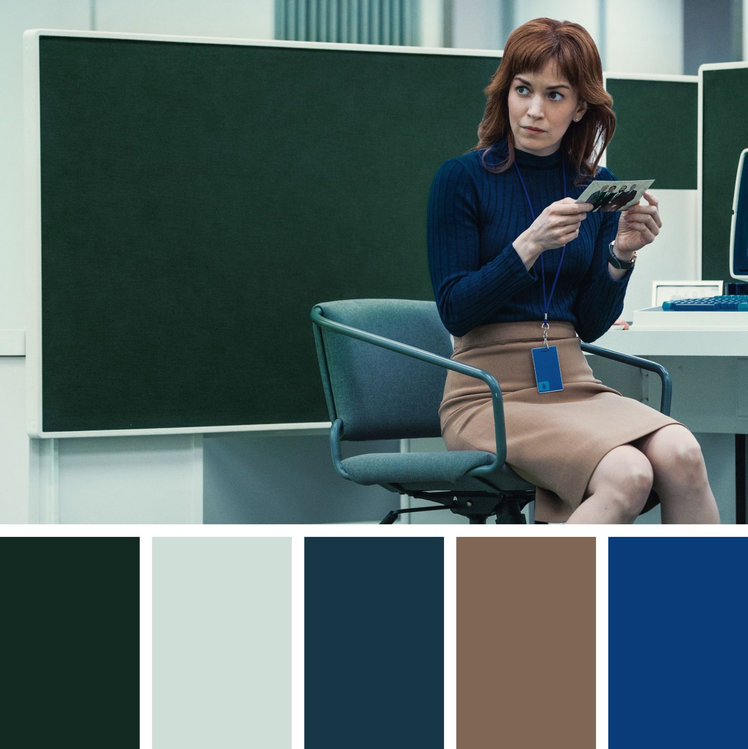
he severance costume design and color scheme is intentionally controlled—cool, muted pastels and earthy tones juxtapose against the stark white and fluorescent lighting of the office spaces. Lumon’s world exists in a vacuum where colors feel simultaneously vintage and futuristic, evoking a sense of unease.
Not only do the colour palette’s used in Lumon play into the offkilter energy of Severance, the brand standards that Lumon sticks to is a lesson in corporate identity in its purest form
• Offices: Deep greens and sterile whites dominate, reflecting a corporate sterility reminiscent of 1970s office spaces
• Wardrobe: Dusty blues, mustard yellows, and muted oranges suggest an era trapped between the 1960s and 1980s
• Personal Life (Outside Lumon): Warmer, more natural tones subtly contrast the corporate void, yet still maintain a subdued, almost washed-out quality.